Solving for Zero
Watch the film now on Wondrium.

The film’s title was kept very simple with just a straight forward usage of the film’s typeface GT Cinetype Mono with some slight animation on the tracking.
Colors
With the film separated into 5 distinct parts based on the technology featured, color worked as an easy way to identify each chapter.
Each chapter was assigned a thematic color with a light and dark shade.

Typography
Given the subject matter of the doc, it felt like the type should remain simple, yet still have subtle hints toward technological innovation. GT Cinetype from Grilli Type seemed to perfectly balance an engineer’s precision with the humanity evident in the film.
Text in all its forms was kept simple, both in design and motion. Since we used color to differentiate between chapters, limiting the film to one font helped unify the total film. Beyond simple fades, only counters and subtle motion (accompanied with subtle sound design) were used.

Left-aligned lower third
On-screen text
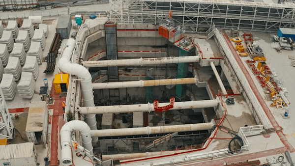
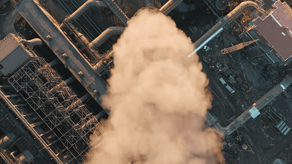
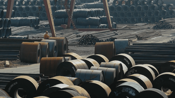
Locations
Right-aligned lower third

Subtitles
Percentages
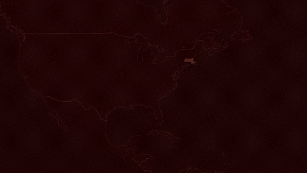
Maps
Along with its own color scheme, each technological chapter of the film had its own map to help transition the viewer to each new main location.


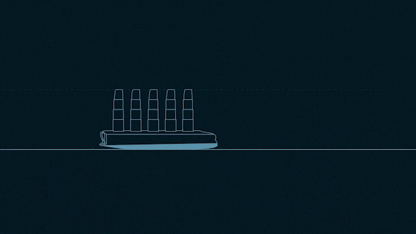
Explainer graphics
Each chapter had at least one explainer graphic to help guide the viewer through understanding the core technological concept that the companies were innovating on. Explainers were reviewed for accuracy by the actual subject matter experts featured in the film.
Explainer graphics remained in the same visual style as the rest of the film, emphasizing simplicity and subtle motion. The overall illustration style was kept to simple line drawings, inspired by blueprints and patent drawings.


Credits
Sarah Bourscheid, Editor
Conner Lee, Motion Graphics Designer
Maria Kjellstrand, Additional Editing
Ian Miller, Assistant Editor
Darren Hartman, Color Grade
Ryan Mauk, Dialogue Editor
Chip Sloan, Re-Recording Mixer
Peter Madsen, Associate Producer
Client: Wondrium
Studio: Blue Chalk Media
Greg Moyer, Executive Producer
Pam Huling, Executive Producer
Julianne Sato-Parker, Director / Producer
Rob Finch, Director
Jason Greene, Director of Photography
Chris Janjic, Director of Photography